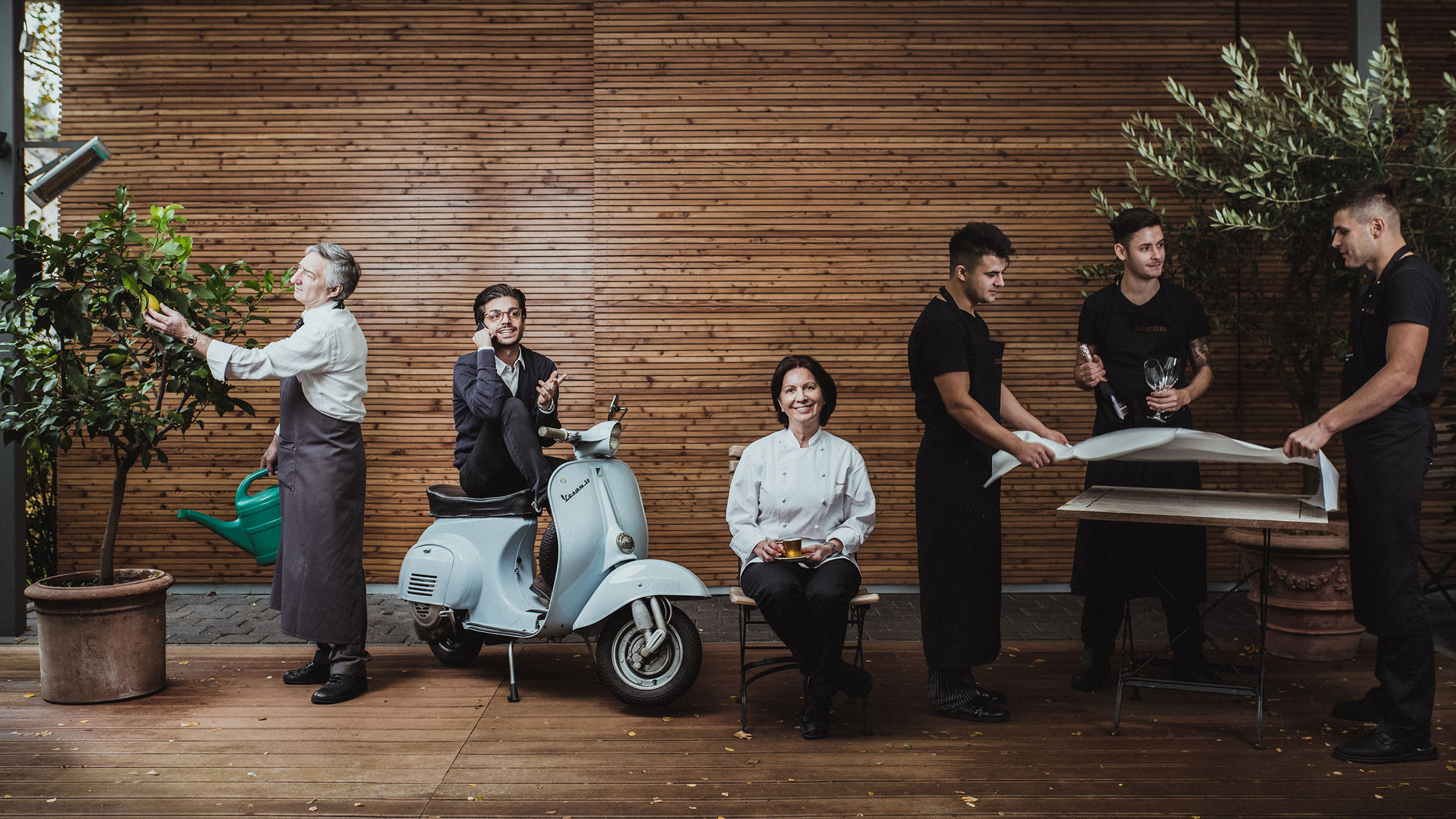
Nannina turns classic Italian dishes into near-religious dining experiences. The setting is elegant, the service impeccable, and it all comes brimming with amore and a dash of down-to-earth humor.
Client
Roles
Photography
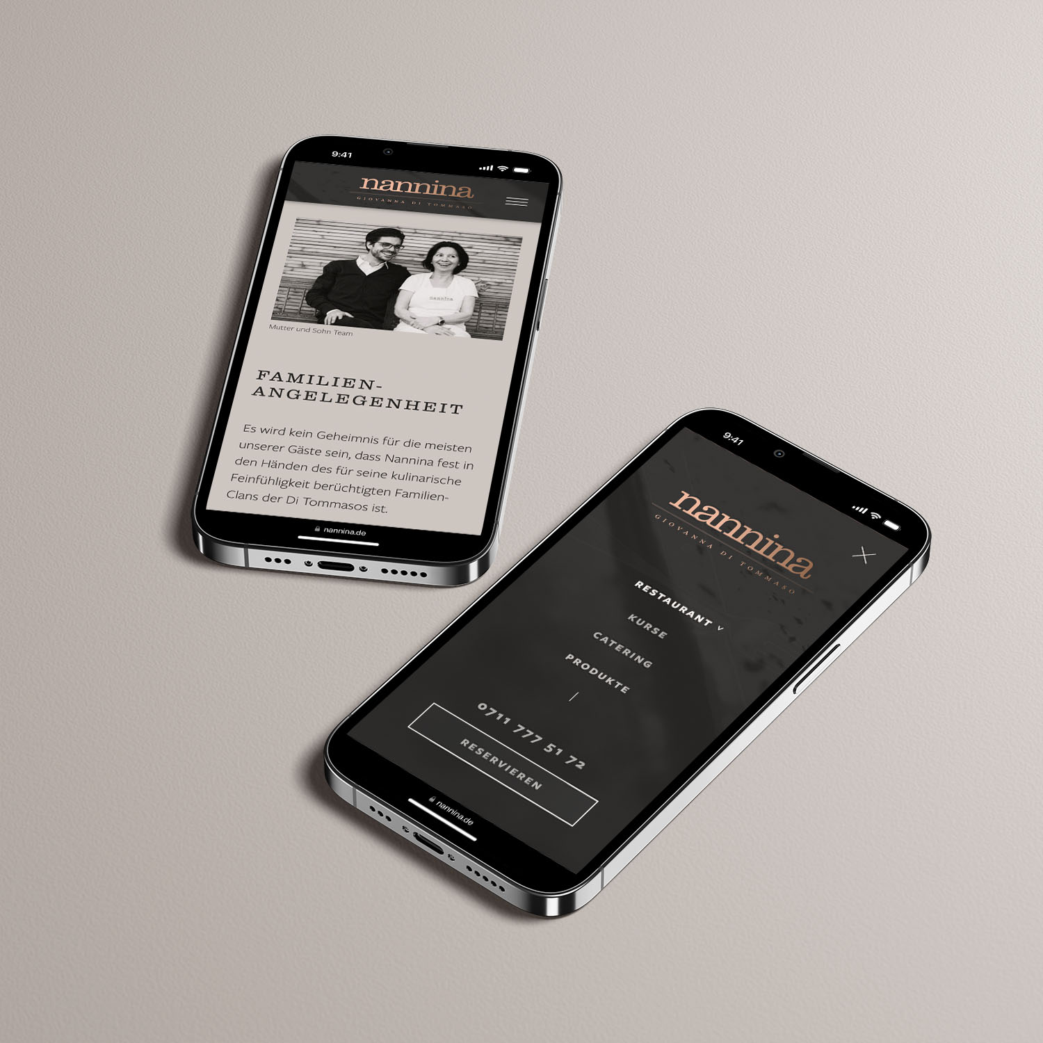
Their old website was clunky, slow-loading, and overall didn't bring across their brand's unique personality, their love for detail, and the art and craft of cooking. Which was, after all, what garnered them an almost cult-like following among Stuttgartian gourmets.
They also had numerous new offers their patrons weren't aware of that needed to be featured on their homepage:
- on-site cooking classes,
- their exclusive catering service, where they cook live at their patrons' location of choice,
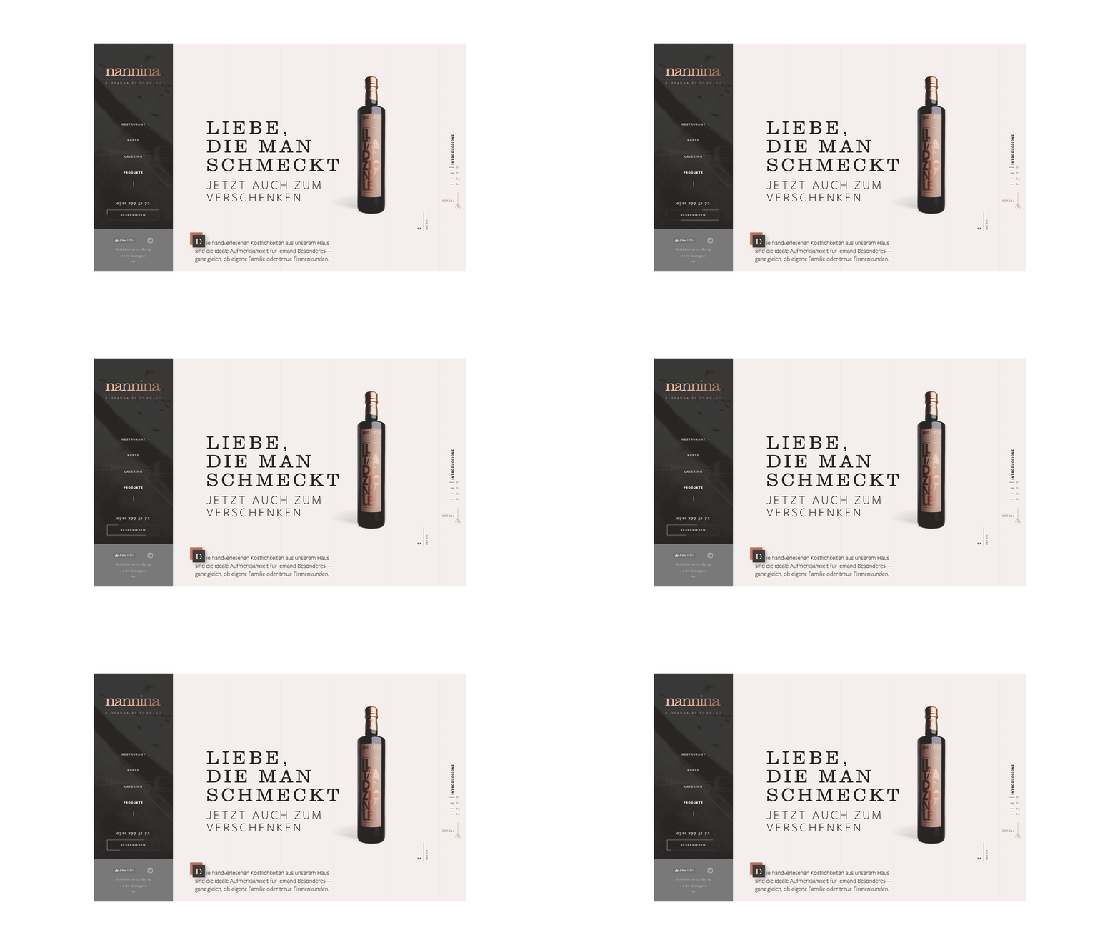
- as well as their own privately labeled olive oil and homemade Cantuccini.
„Yes, we are Italian, and, yes, we delight with Italian food. But Nannina isn't your run-of-the-mile Germanized Italo-kitchen with pizza, pasta, pesto. Nannina is an attitude, a way of being. Both with food AND with people. We’d love for that to come across at a first glance.“
Fabio Di Tommaso, CEO Nannina (translated from German)
We held a two-day-brand workshop, creating story-driven client avatars, and prioritizing business and marketing goals in alignment with their core values. Spending two days at their establishment allowed us to get an up, close, and personal idea of their operations, — and, frankly, to eat ourselves through the carte. Life is tough, but we soldiered on.
Based on the strategic framework, we came up with three different angles for the art direction, showcased to the client in the form of comprehensive mood boards.
The winning direction, dubbed down-to-earth elegance, was
inspired by their minimalistic, yet elegant interior, the earthy mood of Mediterranean wine yards, and Giovanna’s stunning knack for turning simple ingredients into culinary statements that create meditative silence around.
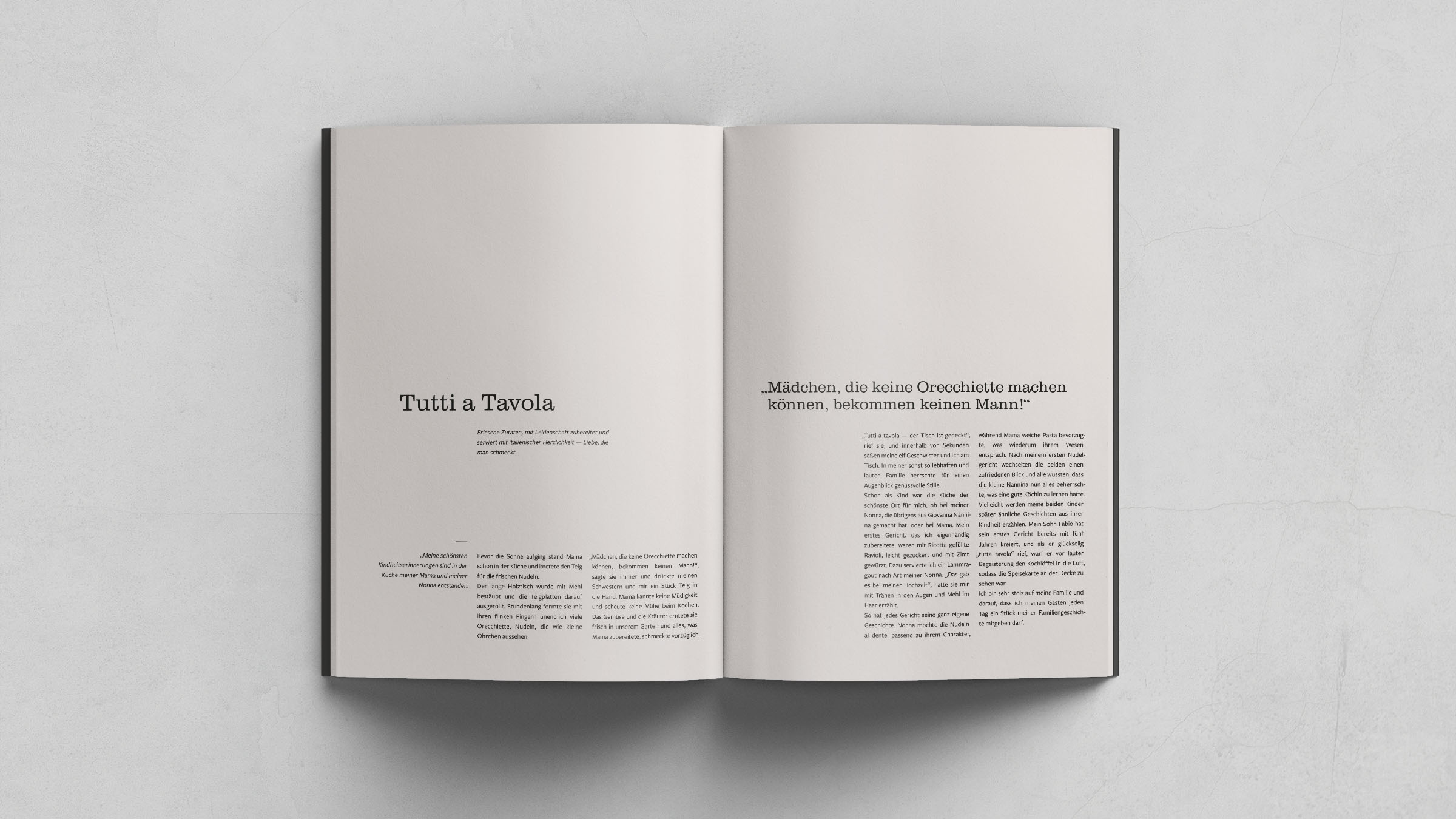
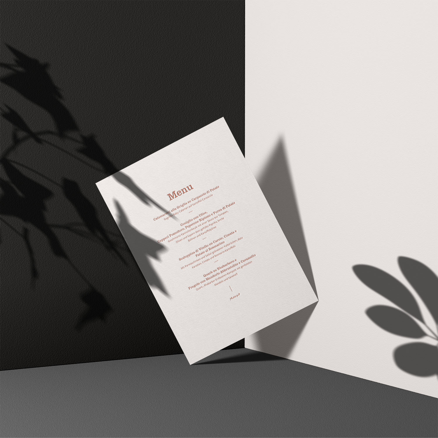
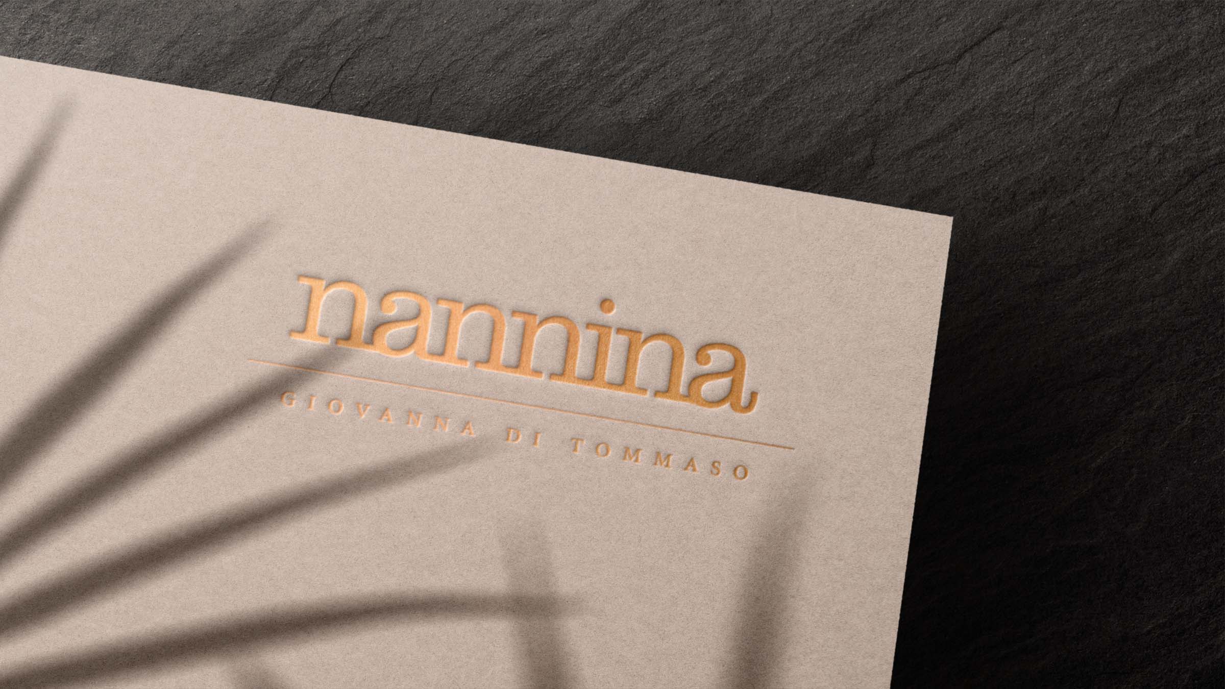
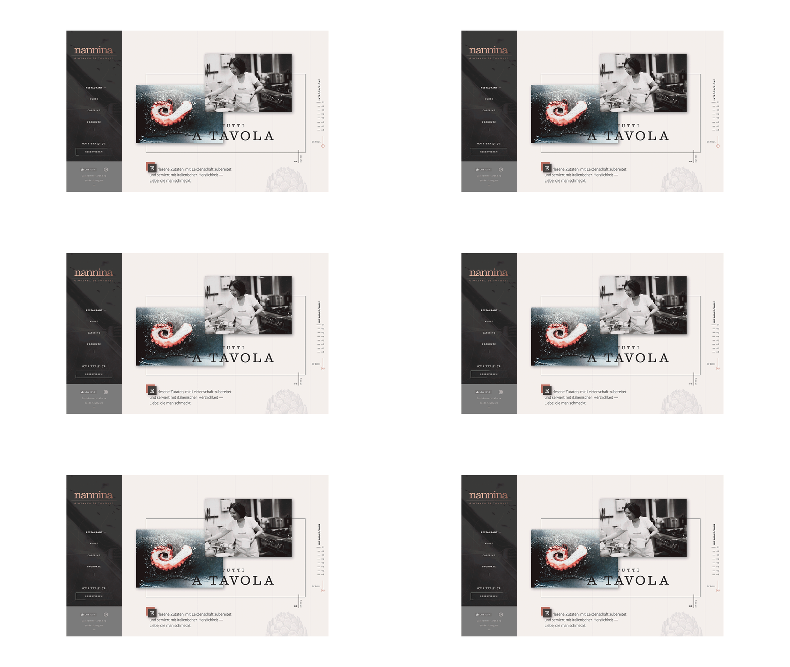
Keeping well within the brief, rather than changing the existing wordmark we used it as the starting point for the whole identity. Thus, the generously letter-spaced Clarendon from the bottom part of the logo got a second use in the primary and secondary headings throughout the project, while the copper-gold gradient treatment of the logo evokes a sense of luxury.
„We are getting calls multiple times a day of people complimenting our new look. Our patrons LOVE the new website. Actual bookings increased by 12%. And we have so many people calling for our cooking classes, we had to raise the prices to 500€ per person. Needless to say, we are delighted.“Fabio Di Tommaso, CEO Nannina (translated from German)
